This is my own bedroom design, but I’ve decided to use it as an example to show how the project works and what the steps are. There will be two posts about the bedroom: this one with the concept and another with pictures of the finished bedroom.
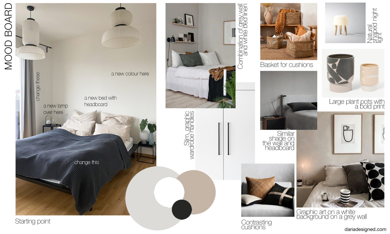
Starting situation: we are both designers. We both work with colour, but when it comes to our home, we prefer monochrome, muted colours, lightness and soft minimalism. Our bedroom is small, facing east. We live in a rented apartment, and our contract does not allow us to make major changes (such as painting the walls a very dark shade). We want to replace most of the items in the room and leave only the wardrobe, night tables, and some of the lamps.
My husband and I discussed all the things we weren’t happy with in our current bedroom and what we would like to get.
We made a list of the main problems with the current bedroom:
• The room looks very basic now, it almost doesn’t feel like we live in it. We want to add a little more personality, add our love of contrasts, different materials and geometry
• Boring, too flat colours, too much uniform white, no colour accents
• Want to visually connect the bedroom with the rest of the apartment

Finding solutions
First of all, I decided that the room needed to add more contrast and more variety in shades and textures. But at the same time, I wanted to leave it fairly neutral and soft in color.
Choosing primary colors and textures
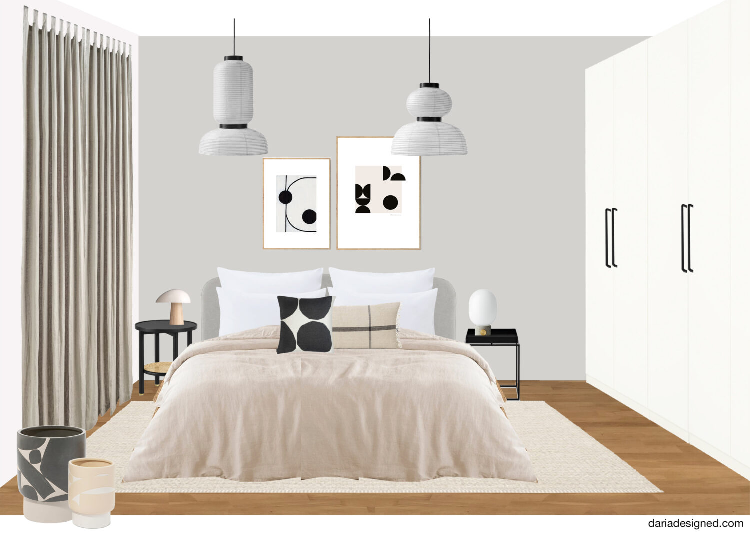
I really liked the picture where the color of the headboard of the bed almost matches the color of the wall. It creates a cool dissolving effect and I wanted to replicate it in my space. So we chose the color of the wall behind the bed and the bed itself at the same time. I chose a soft shade of gray. First of all, because gray highlights the other colors beautifully. And secondly, white looks especially bright against the gray, and I have long wanted linens like in hotels – white and made of crisp high-quality cotton. Beige was chosen as another base color. We decided to add it with fabrics: a beige bedspread, light beige curtains, and maybe a beige carpet.
Adding contrasts
I like it when the contrast is not only in the colour but also in the material or in the pattern, so I decided to add bright accent cushions with a large pattern and an interesting fabric to touch. To make sure the cushions weren’t lonely, the plant pots were also chosen with a bold pattern.
A drop of black
I am very fond of black. It brightens up all the colours that are next to it, so I especially like it when it appears in a light-coloured interior. It adds depth and contrast. We already had enough black in our bedroom, so I decided to add just a little bit of it and only as accessories.
Choosing the shape of the lamp
The room already has two beautiful pendant lights made of rice paper by &Tradition and a Menu lamp on my husband’s bedside table. In addition, all of the lamps in our flat are either round or oval in shape, so I decided not to get away from this concept and choose a lamp with an oval, natural shape.
To sum up, the concept for the future bedroom is this:
• Gray and beige as a background to white and black
• Lots of linen and crisp cotton
• Some light wood, some thin black metal
• Naturally shaped lamps
• Large prints on cushions and pots

I’ll soon write a second post about what came out and will show how our bedroom looks compared to what it was before the redesign. Stay tuned 😉
If you like my vision of a cozy and nice-looking interior and want to make your home more pleasant with my help, you can book one of my interior services. I will be happy to help you create the home of your dreams.